I have an idea for a flyer, I would like to put a little Knight of the Green Room on it. Unfortunately I'm not very good at actually drawing things like that (I'm better at more abstract things). So I was wondering, the little knight that appears whenever the green room is conquered, could I use him/her in the flyer? If yes, then could someone please link me to the image?
Can we collaborate? I have some ideas, but when it comes to digital design (or whatever this is) I'm completely clueless. Also, how many entries can each person submit? And can someone please give me a few basic start-up tips (like designing sites or whatever)? I love art, and I'd like to give this a try. ^_^
@dragonlily - Collaborating is ok with me. You just have to be prepared to share the prizes if you win! Also, I do not mind on the number of submissions. The more the merrier! @Rosey%20Unicorn may be able to help you on some design tips! My advice is just to give it a go!
Have fun!
"There is a dead spot in the night, that coldest, blackest time when the world has forgotten evening and dawn is not yet a promise."
Design tips, for everyone. Straight from my first graphic design class ever...
Contrat When things are different, make them really different! This means putting different categories of fonts together (serif with sans serif, big stuff with little stuff, ect). Basically if stuff is supposed to be different, make sure they cannot be confused for being similar!
Repetition Repeat design elements as much as possible (but it's best to not repeat the logo/other pictures!). If a font shows up once, then try to use it twice. Use colours in multiple areas. If you add something like a pretty swirl, try to use it at least twice.
Alignment Have a design element line up with everything. If you draw a straight line in any direction, then there's something it's up against.
Proximity Group like elements together! Put one type of information in one location, another type of information in another location, and everything that relates to each type near those things.
These spell out a handy acronym for you to remember in the design process, haha
When it comes to how to build the design!
Select a focal point. This can be anything. Have strong contrast between the focal point and anything else in the design.
Group the information together.
Make sure everything aligns with something.
Make sure every design element repeats somewhere, sole exception being the logo/pictures. Fonts, pretty swirls, colours, and blocks, however, are fair game for repeating.
A writer is a world trapped in a person— Victor Hugo
Ink is blood. Paper is bandages. The wounded press books to their heart to know they're not alone.
Out of all of them, I'd probably go with Inkscape because it appears to be a combination of photoshop, illustrator and indesign (Adobe's three main design tools) in an up to date format (CS2 is very, very old) and free with no conditions. Plus, it lets you to digital art on top of layouts!
A writer is a world trapped in a person— Victor Hugo
Ink is blood. Paper is bandages. The wounded press books to their heart to know they're not alone.
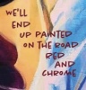
Our thing progresses I call and you come through Blow all my friendships To sit in hell with you But we’re the greatest They’ll hang us in the Louvre Down the back, but who cares? Still the Louvre.


Gender:
Points: 1832
Reviews: 121